Sunshine Daycare Website Design
PROJECT OVERVIEW
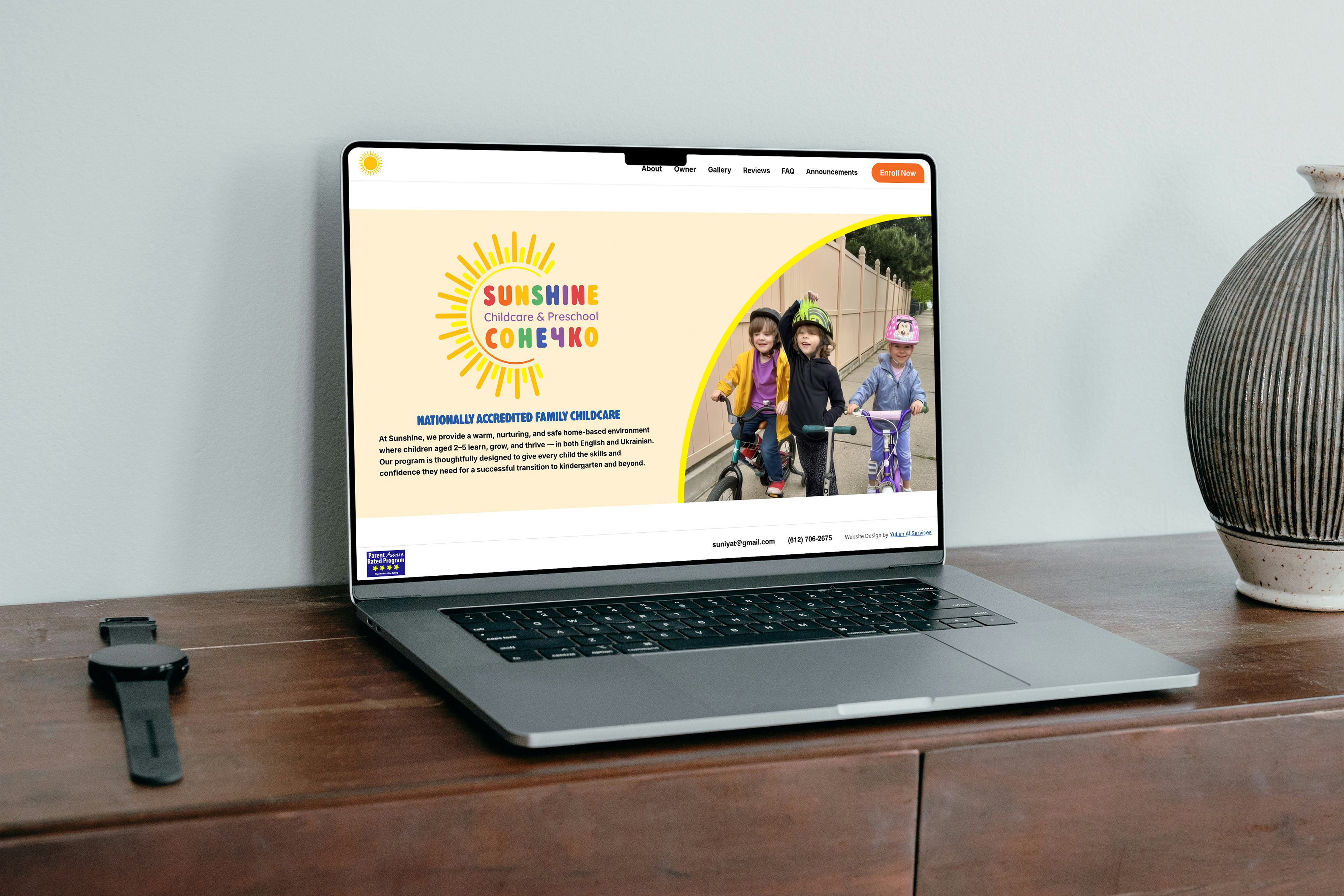
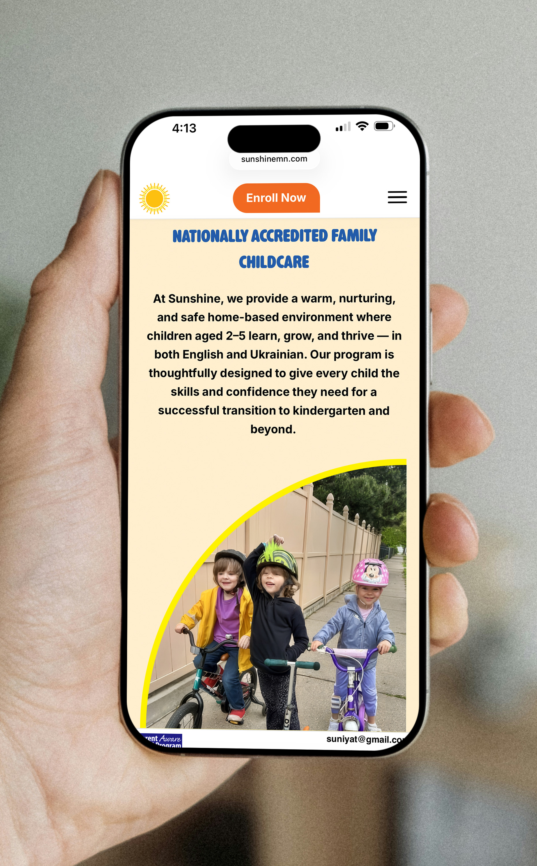
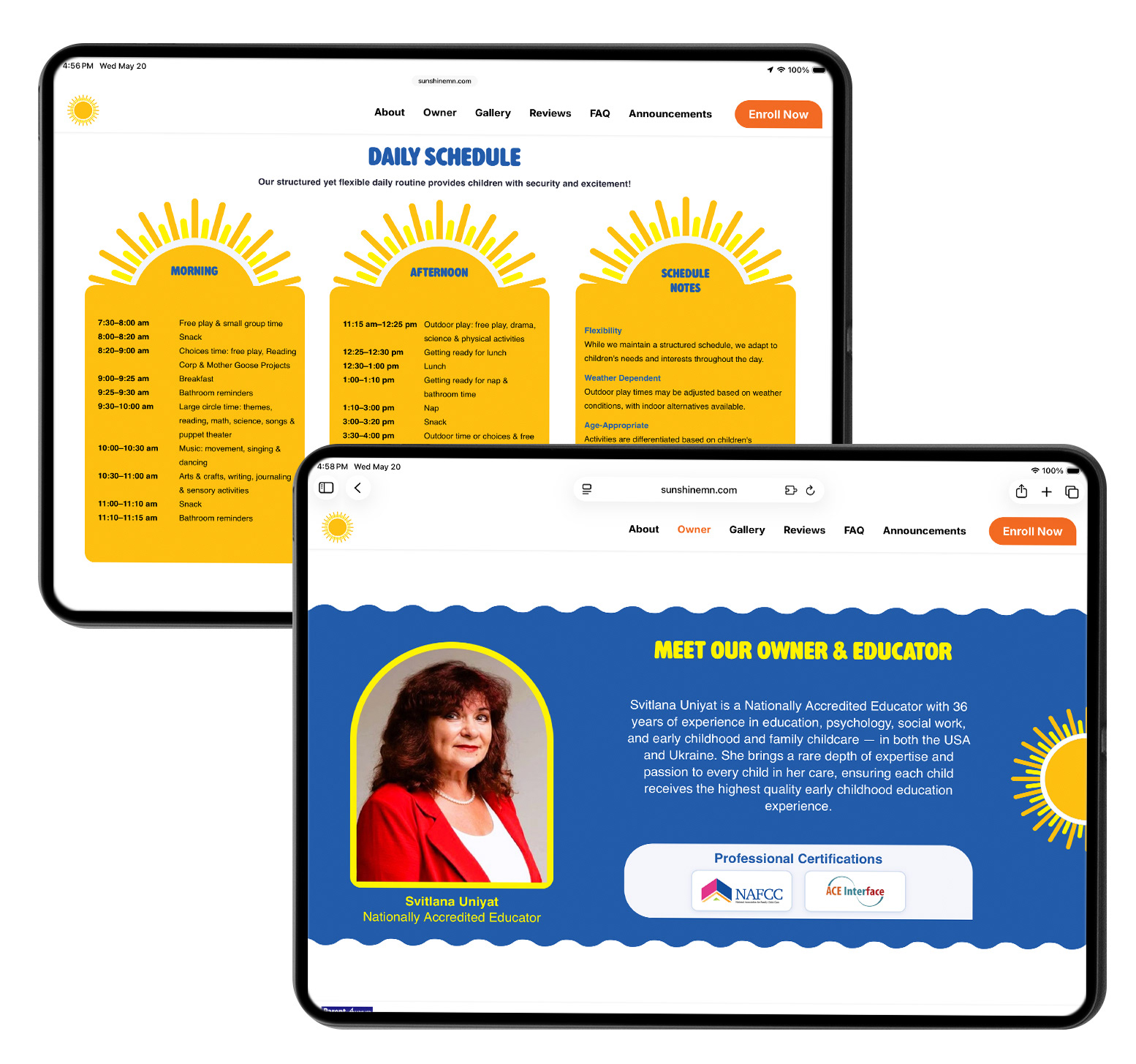
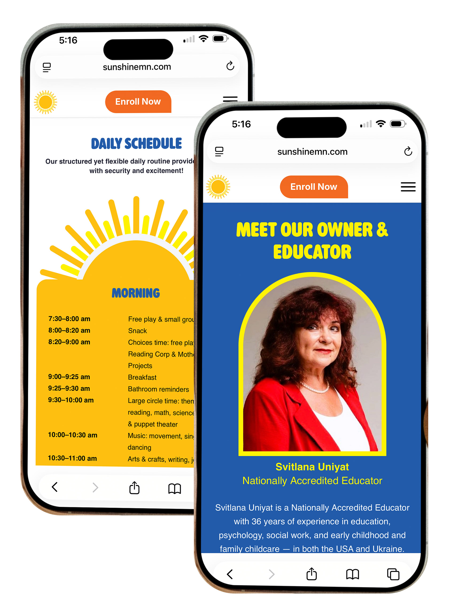
For Sunshine Daycare, I designed a warm and inviting website for a well-established bilingual daycare that immerses children in both English and Ukrainian language, culture, traditions, and community. The challenge was to create a digital experience that felt welcoming to parents while also expressing the daycare’s deep commitment to high-quality early childhood education and whole-child care.
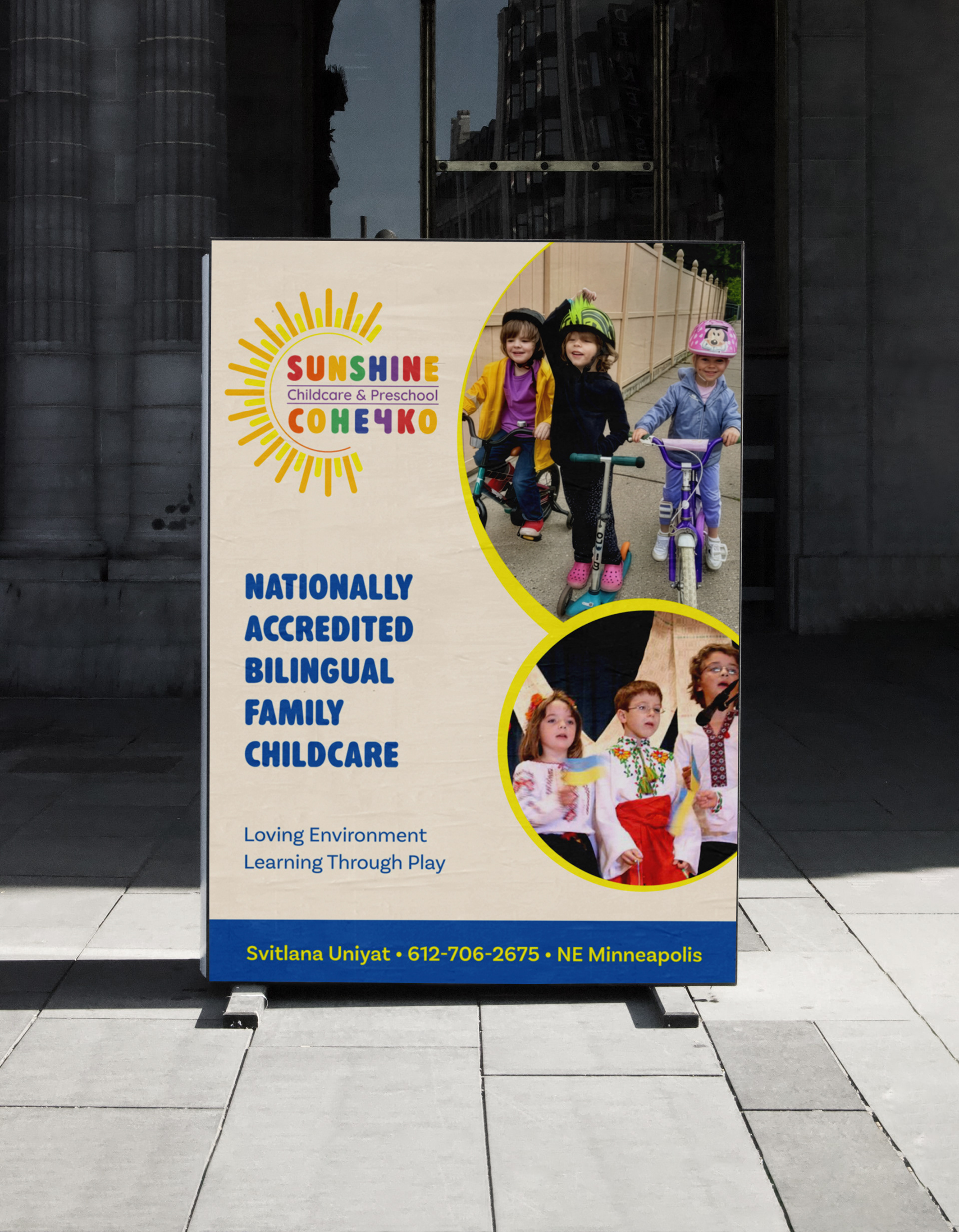
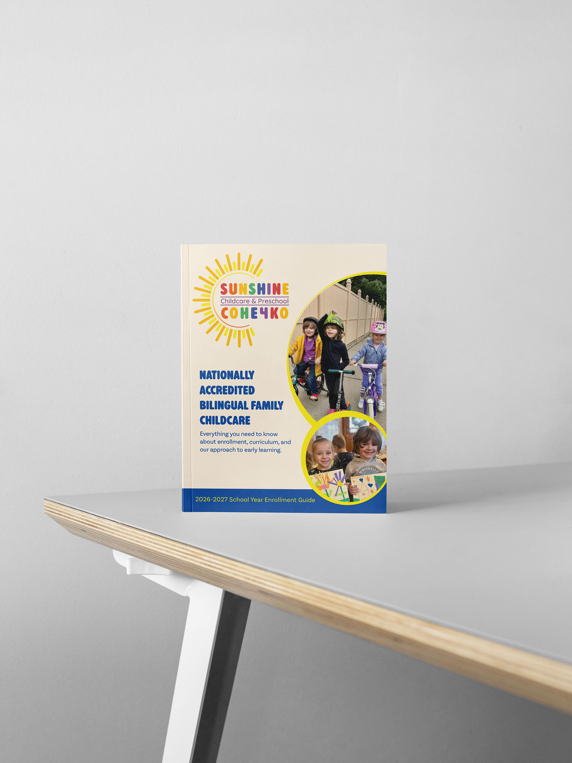
The visual identity draws from the yellow and blue of the Ukrainian flag, softened with a playful, child-friendly palette to create a balance of cultural meaning, trust, and warmth. Through thoughtful use of color, typography, and layout, the final website communicates a loving, supportive environment where children feel safe, valued, and inspired to learn through exploration and play.
My Contributions
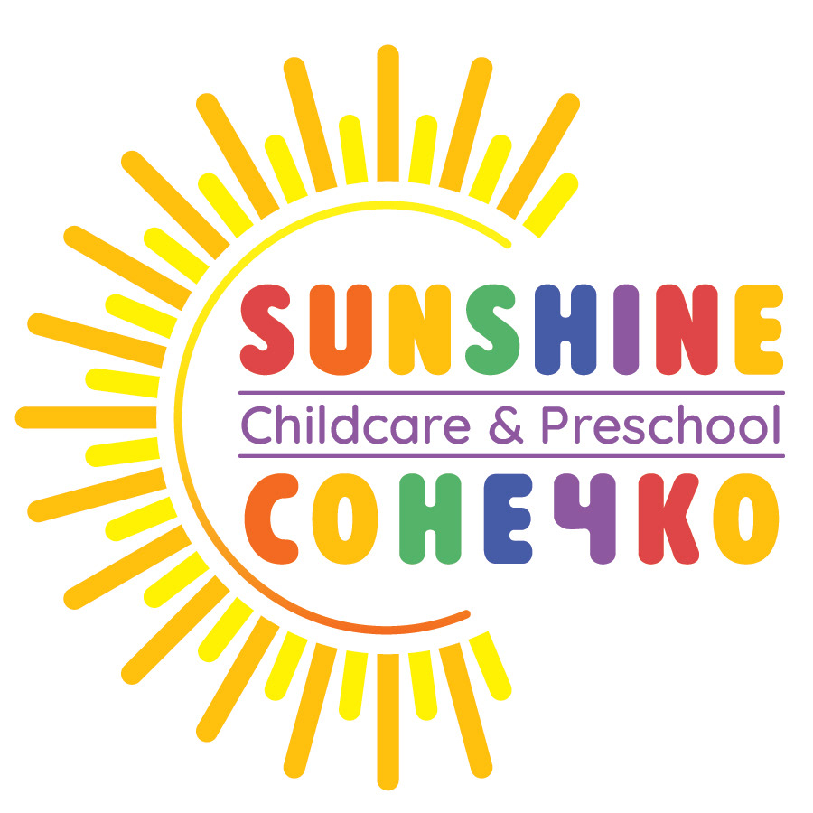
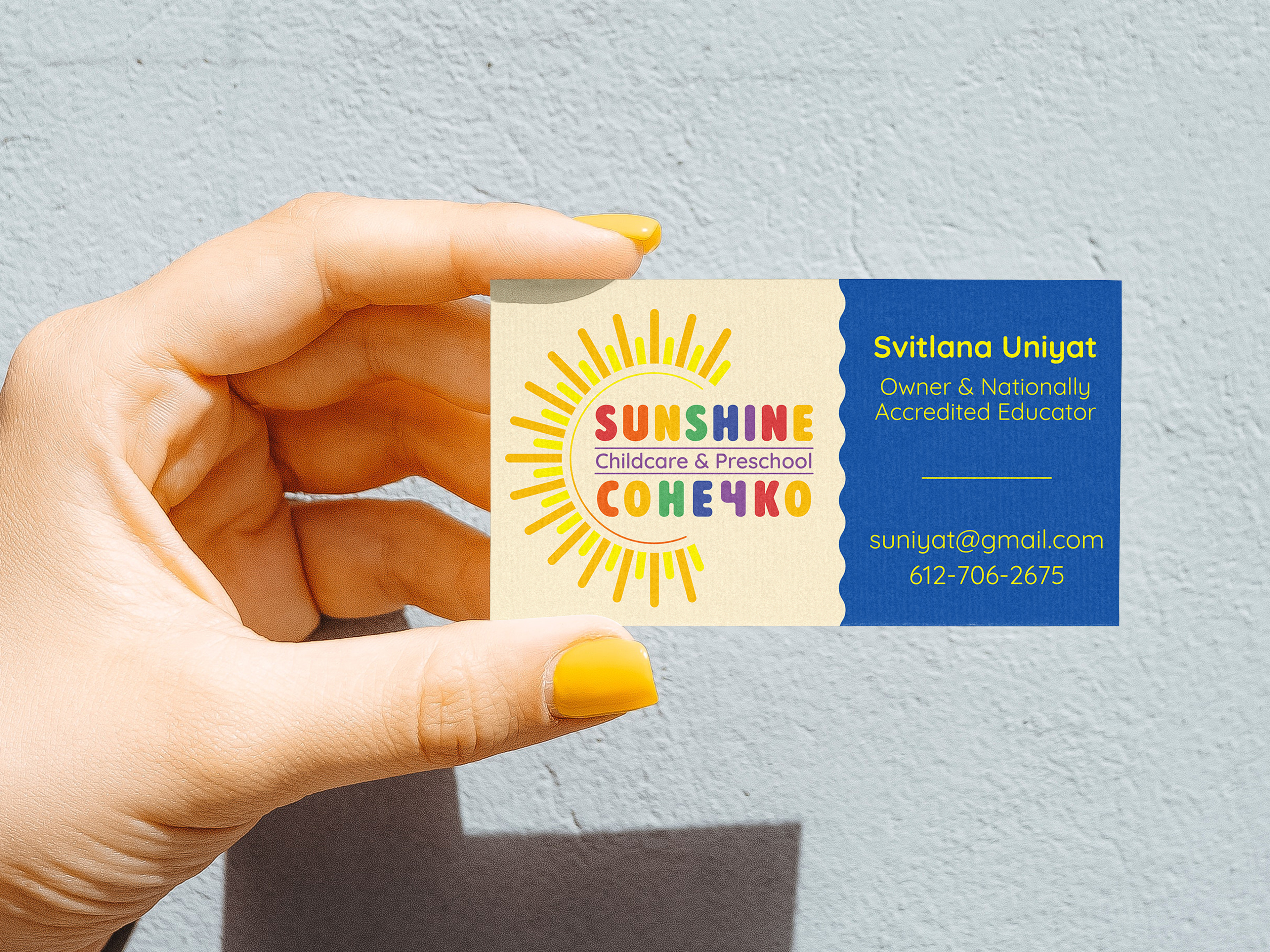
I led the visual design from logo through full site. The bilingual logo unified "Sunshine" in English and Ukrainian with a sunburst icon, using warm, child-friendly colors and approachable typography. The website's color palette extended the logo's visual language, creating brand cohesion across every touchpoint. Using client-provided photography, I designed all page layouts and the favicon to communicate safety, trust, and developmental support.
ContribUTIONS
Branding, Design & Layout: Elena Hoyt
Code & Systems: Yuliya Galperina
Branding, Design & Layout: Elena Hoyt
Code & Systems: Yuliya Galperina
AG Health Counseling
PROJECT OVERVIEW
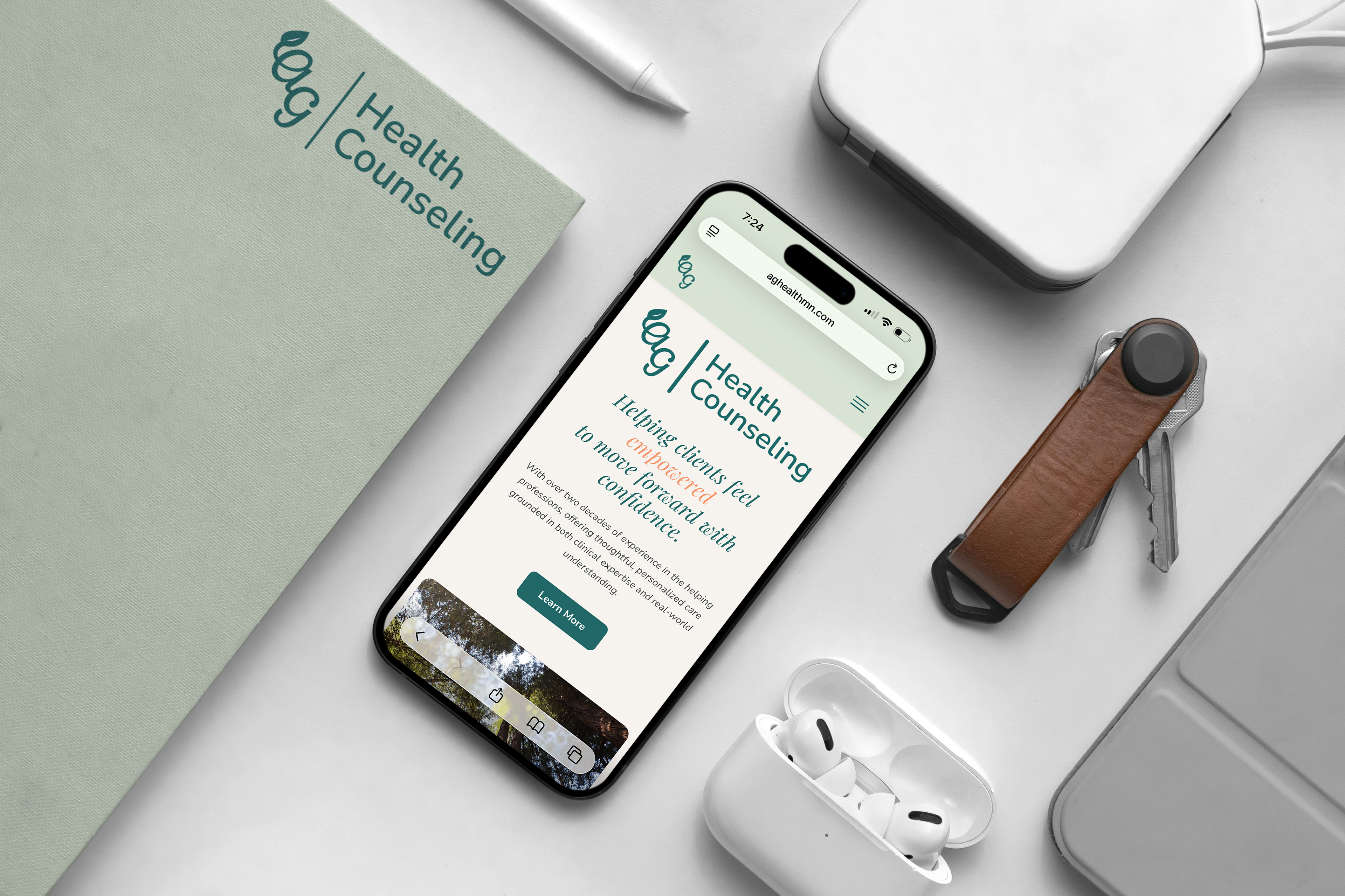
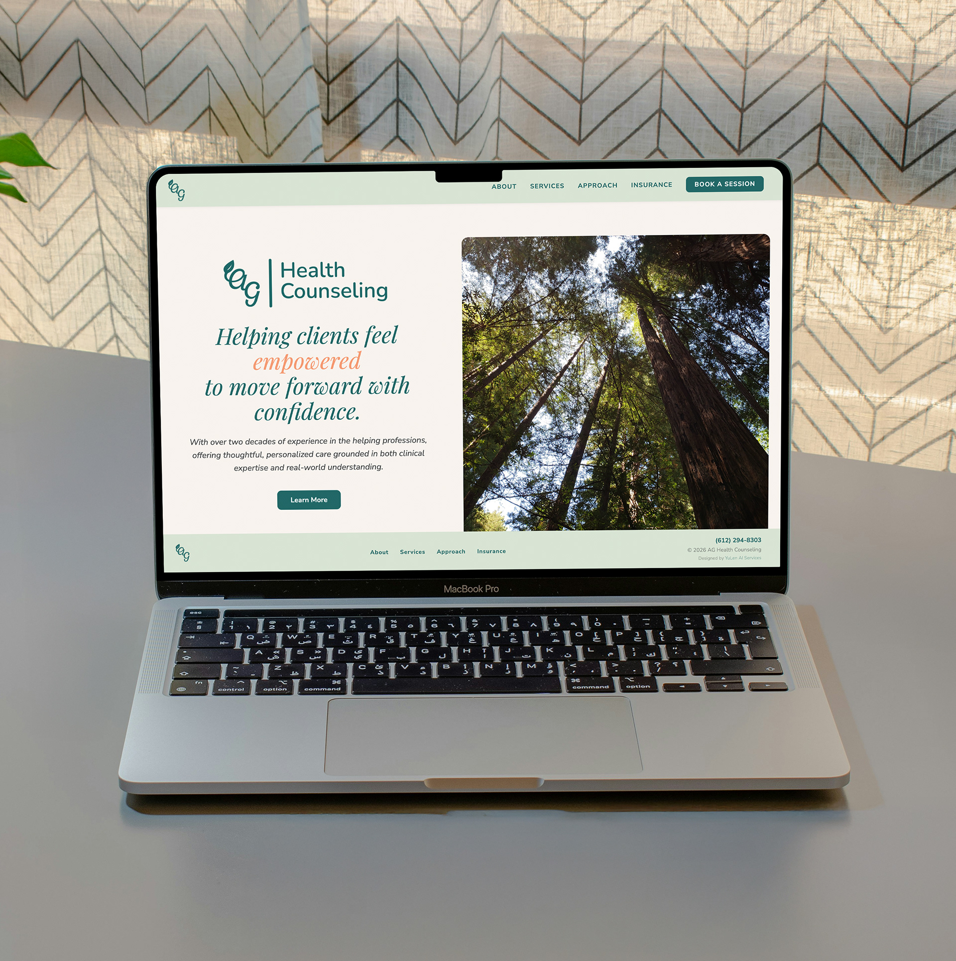
AG Health Counseling is a new website created from scratch to give prospective clients a calm, reassuring first impression and a clear path to support. The goal was to design an inviting online space where visitors can easily find answers to their questions and feel confident choosing this counselor.
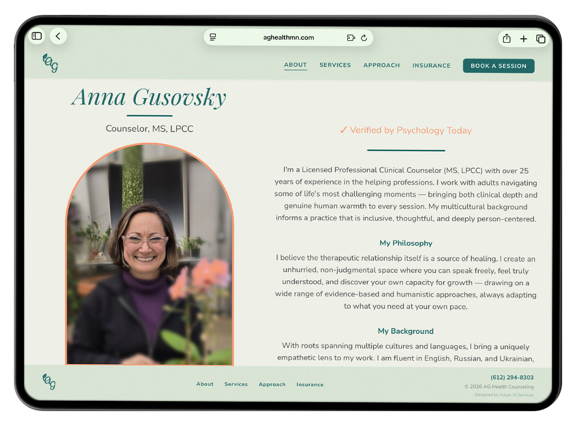
We structured the site to make navigation intuitive and low-stress, guiding users from high-level information about services and approach into more detailed content at their own pace. Warm, approachable visuals and a soothing color palette help convey safety, trust, and emotional balance, while typography and spacing keep the content easy to scan.
Throughout the site, we prioritized clear language, thoughtful hierarchy, and uncluttered layouts so visitors never feel overwhelmed. Key actions, such as learning more about the counselor, exploring services, and reaching out to book an appointment, are consistently highlighted, helping people move from curiosity to readiness with a sense of peace and assurance.
Overall, the site is crafted to feel like a safe, welcoming environment online: visually calming, easy to navigate, and focused on helping people move from uncertainty to a sense of clarity and trust.
My Contributions
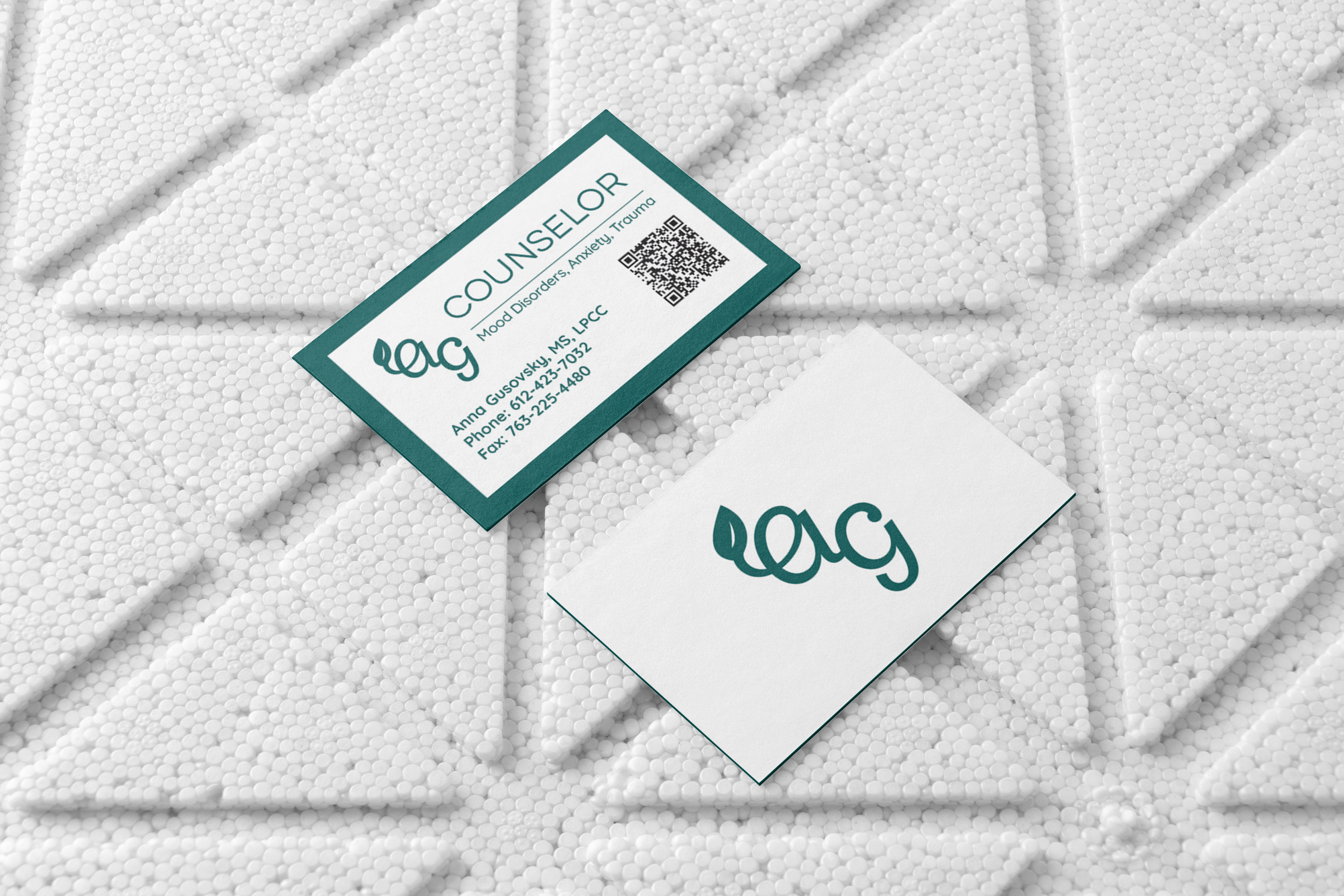
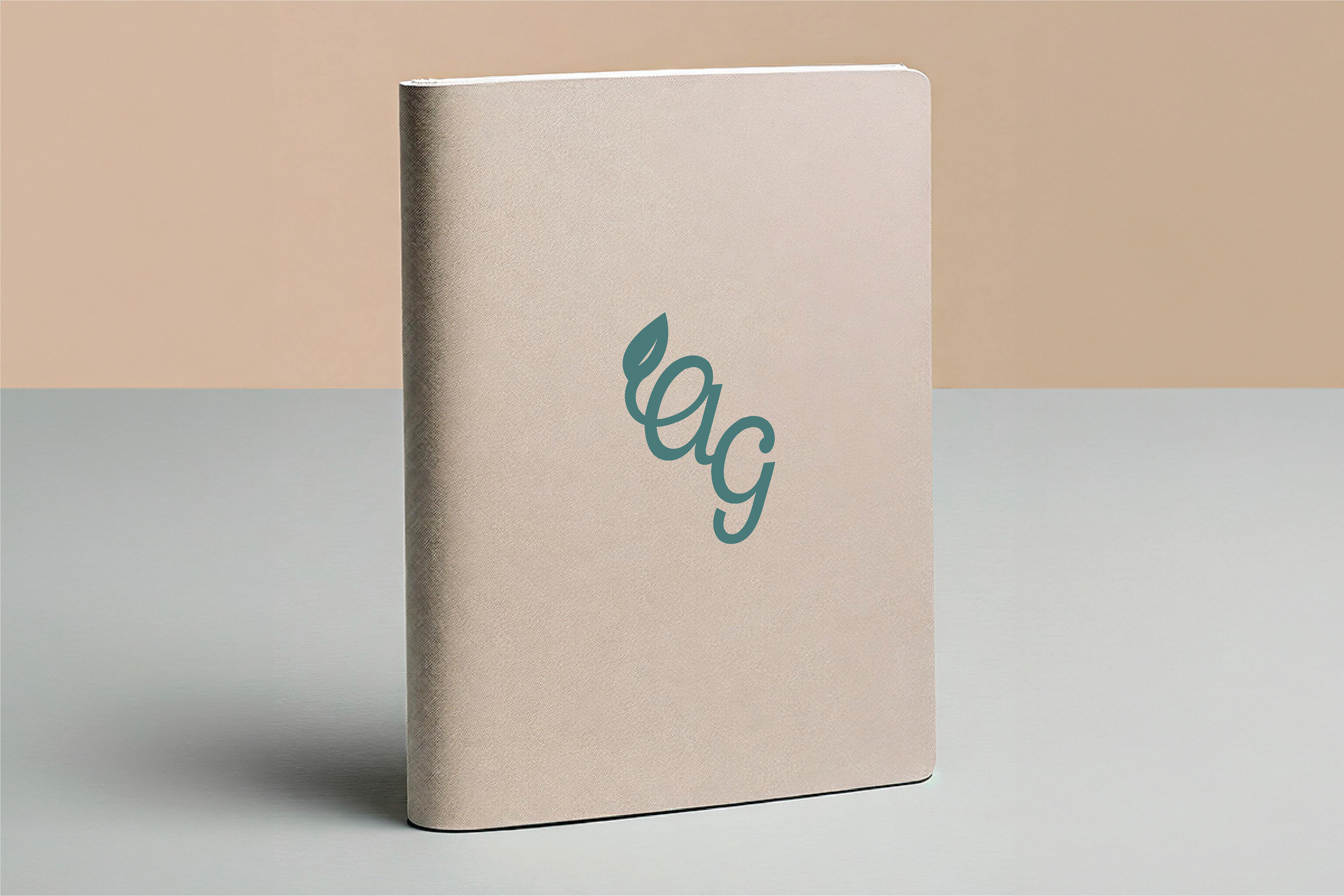
I began by refreshing the AG Health Counseling logo a few years prior to the website project, updating it with more modern elements, typography, and color to better reflect the practice’s current identity. For the website, I built on that foundation by selecting the existing primary color and expanding it into a cohesive system of secondary and supporting hues designed to feel soothing and trustworthy to visitors.
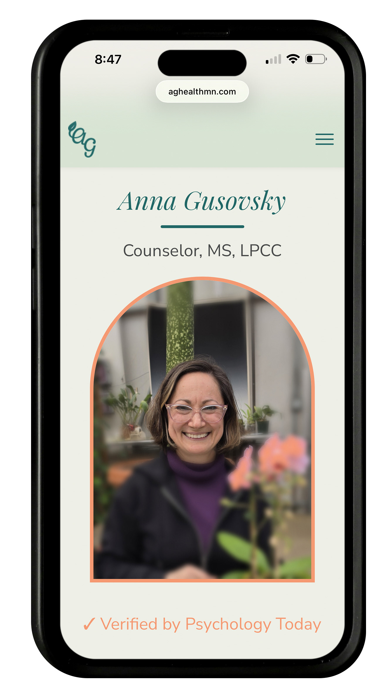
The visual language centers around a deep, grounded teal as the primary brand color, supported by soft greens and a light, airy blue-tinted tone. These hues work together to convey stability, renewal, and emotional balance. A gentle peach accent adds warmth and a human touch in key moments, while a warm neutral background keeps the overall experience light, approachable, and non-clinical.
I paired this palette with clean typography, generous white space, and clear visual hierarchy so that content feels easy to scan rather than overwhelming. I also designed the page structure and layout to be intuitive and low-stress, guiding visitors from an overview of services and approach into more detailed information at their own pace.
ContribUTIONS
Branding, Design & Layout: Elena Hoyt
Code & Systems: Yuliya Galperina
Branding, Design & Layout: Elena Hoyt
Code & Systems: Yuliya Galperina
YuLen AI Services
PROJECT OVERVIEW
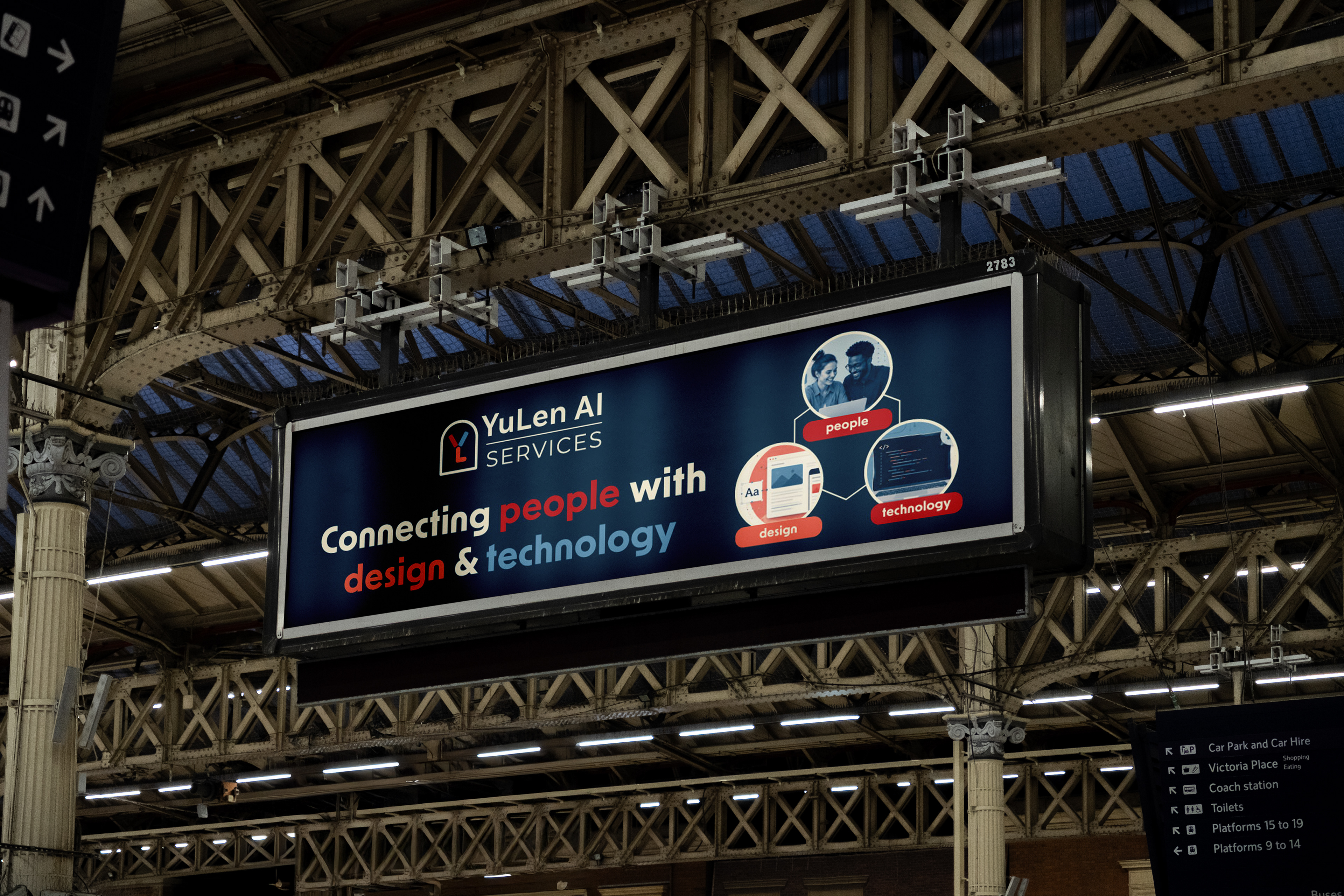
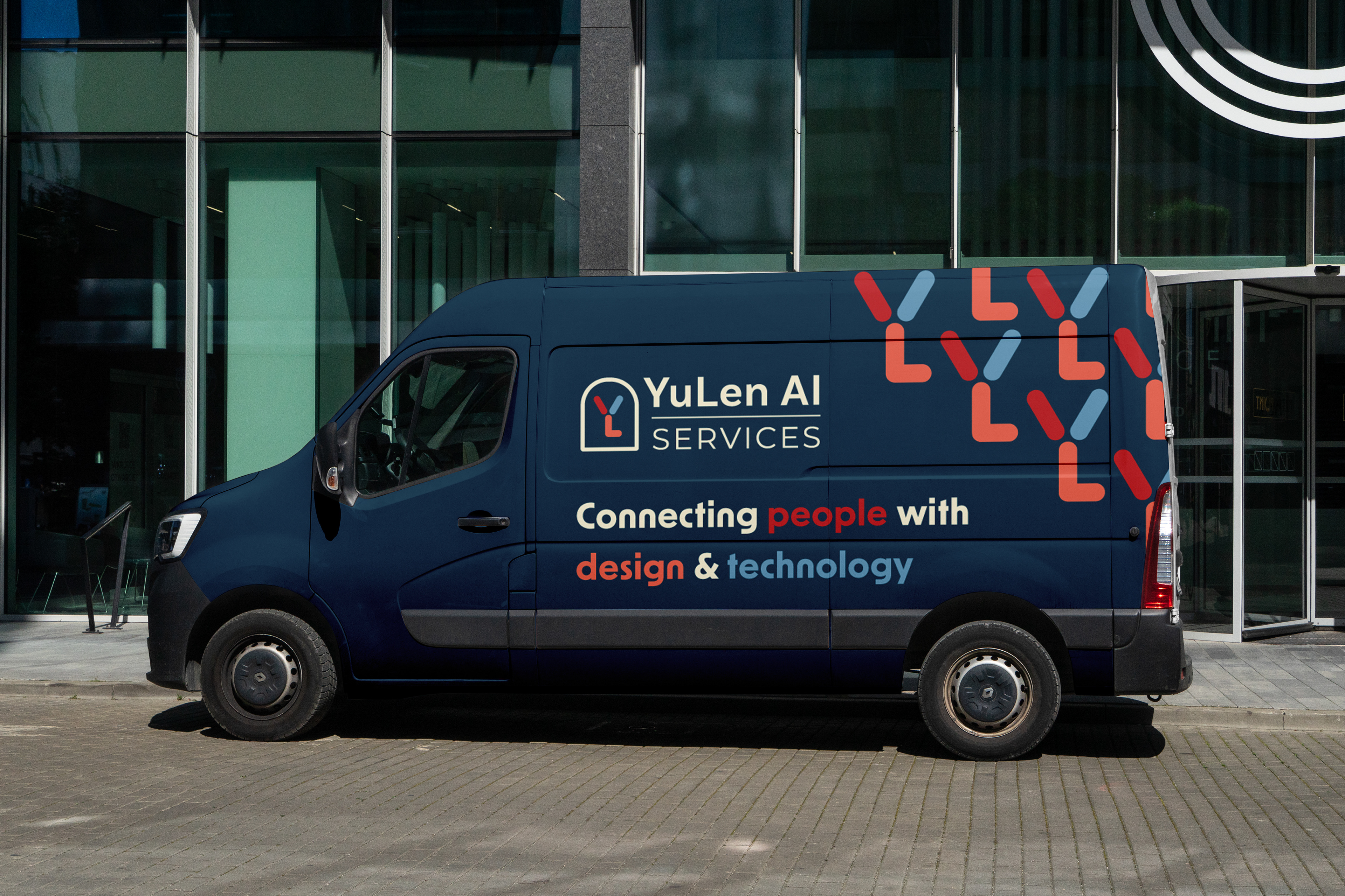
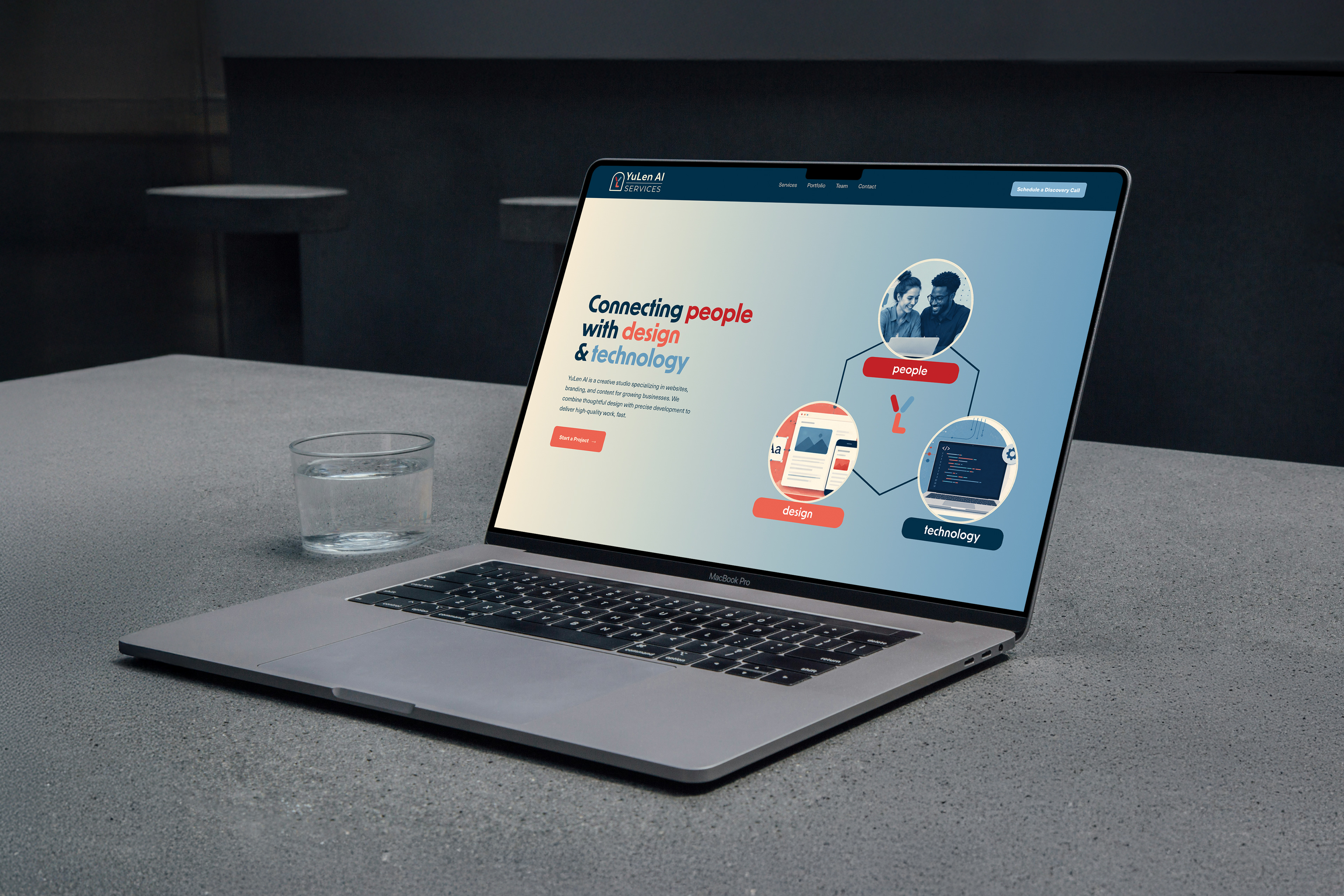
YuLen AI Services is a co-owned website and brand created to help small businesses strengthen their online presence and present their products and services in a clear, professional way. The website introduces the company’s goals and mission, and also showcases examples of previous projects to help build trust and give visitors a better sense of the team’s work.
My Contributions
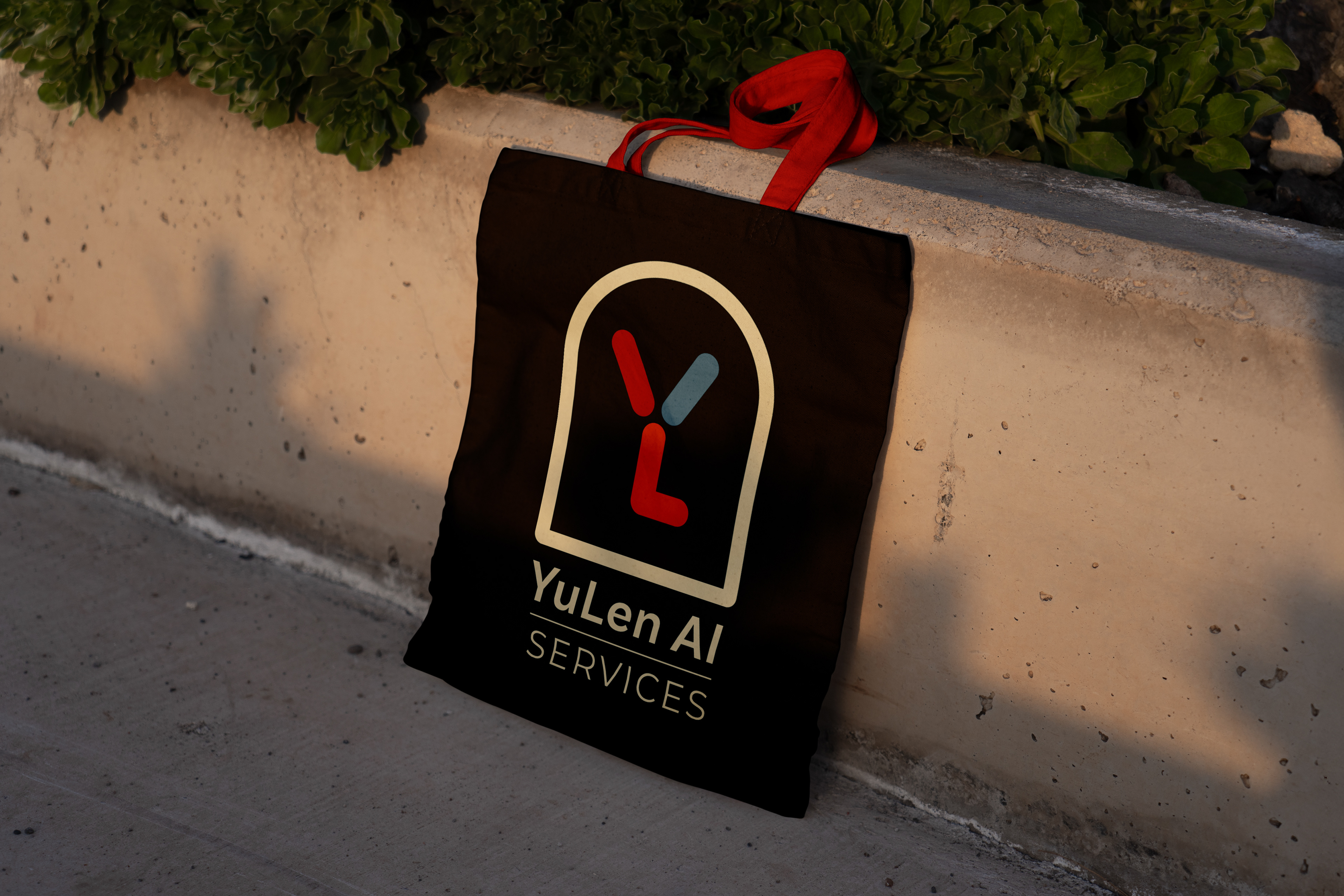
I was responsible for the branding and visual design direction of the site, including the typography, color palette, and layout structure. I focused on building a cohesive, modern look that felt professional, approachable, and aligned with the brand’s purpose.
ContribUTIONS
Branding, Design & Layout: Elena Hoyt
Code & Systems: Yuliya Galperina
Branding, Design & Layout: Elena Hoyt
Code & Systems: Yuliya Galperina